I took the opportunity to update my logo in the fall of 2019. The goal was to breakdown and use ideas from the original concept and use that as a foundation to pivot into a design solution that was simpler and cleaner.
PROCESS
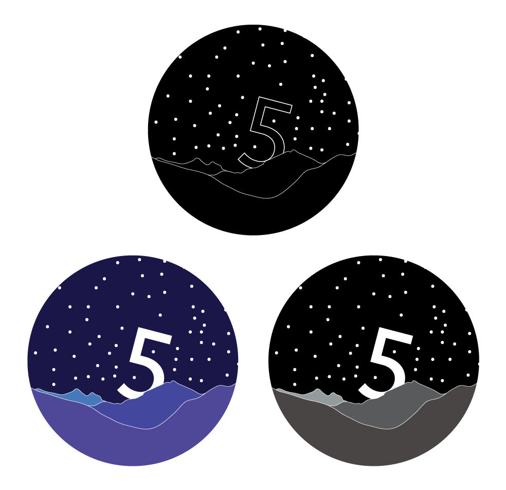
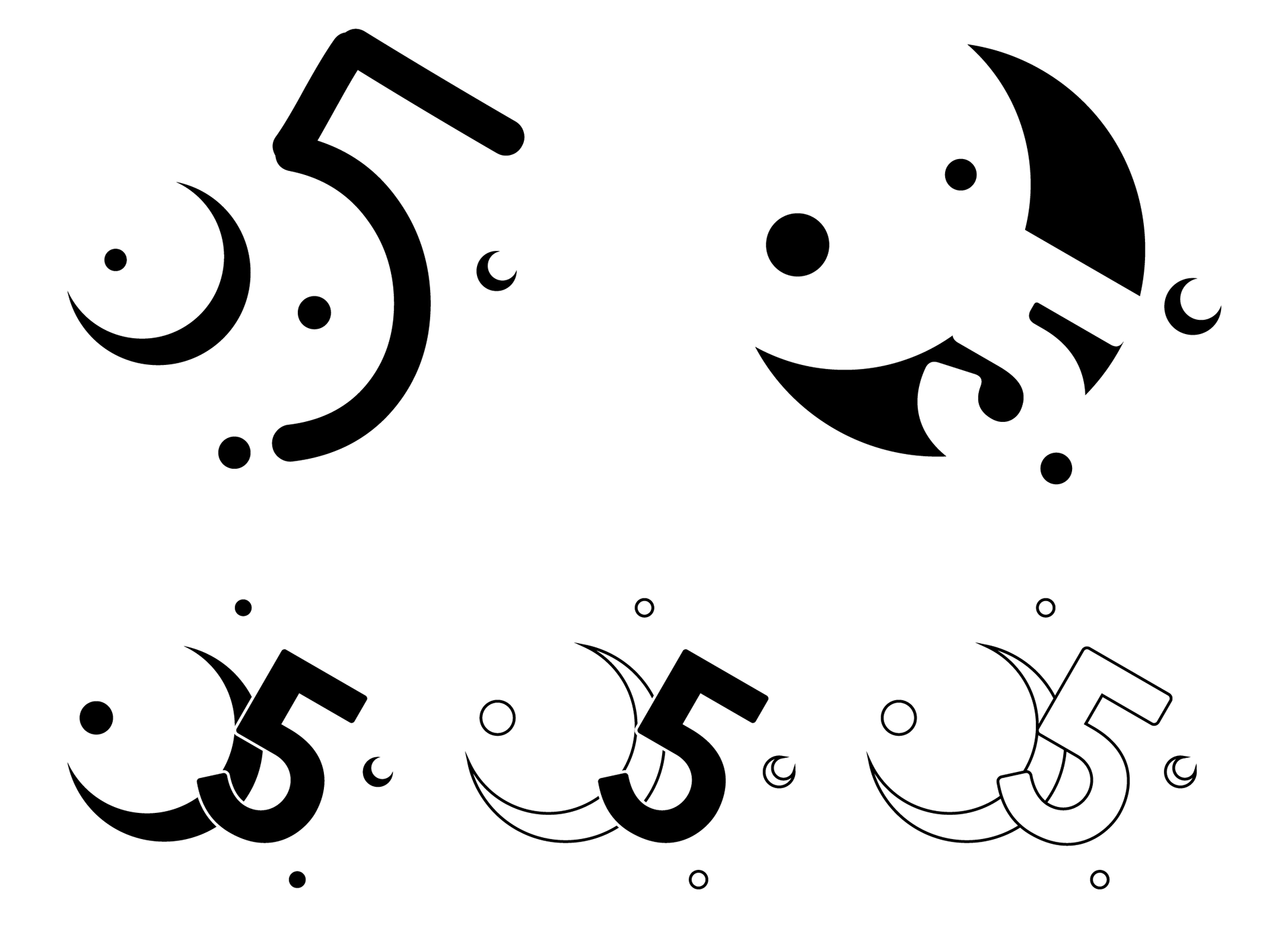
I grew up with comic book characters such as Superman, Batman, Spider-Man, and the X-Men. All of these characters wore symbols that connected them to personal stories unique to each character. I wanted to re-design my logo with the same approach. I began by identifying the individual elements in the original design—the moon and 5, stars, and mountains—and sketching different combinations of these elements. I sketched by hand and then moved into Adobe Illustrator as well, working between my sketchbook and Illustrator to try different directions.
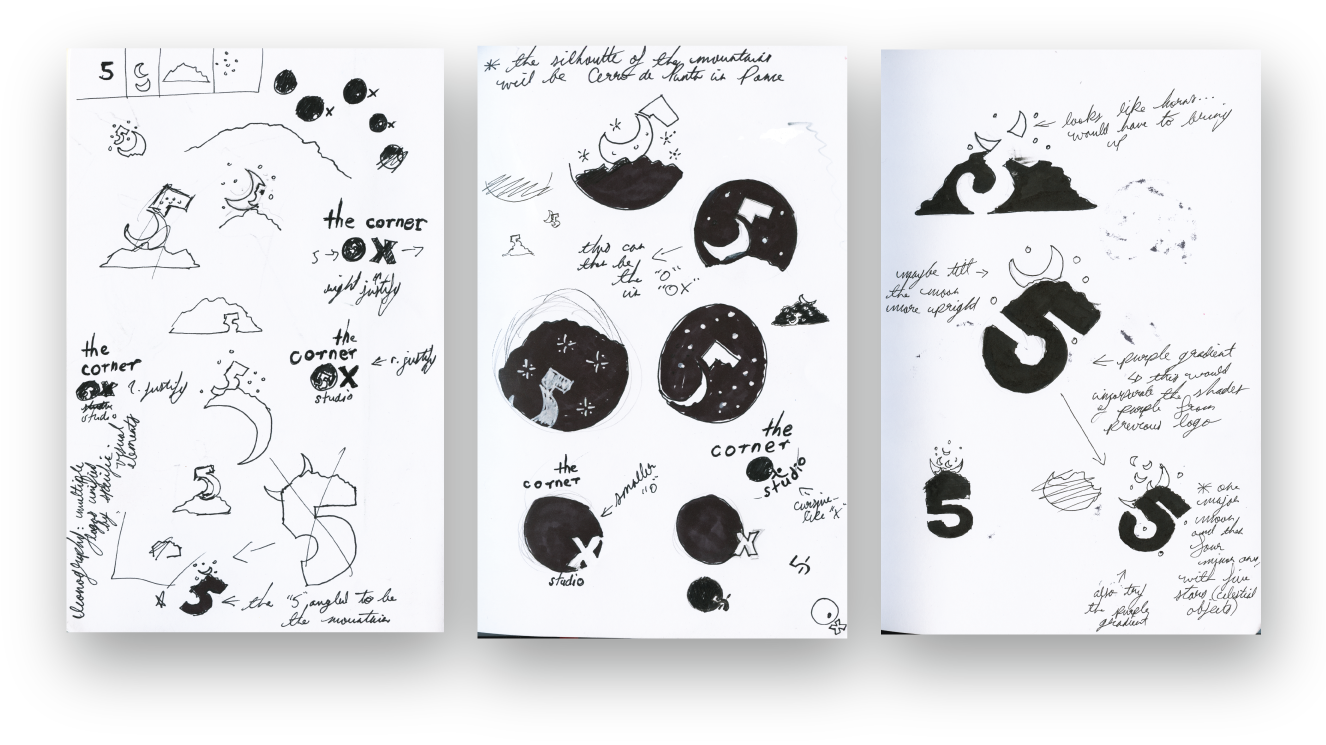
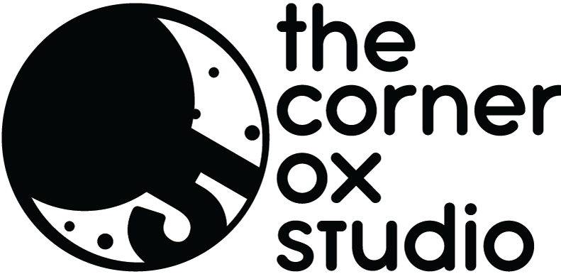
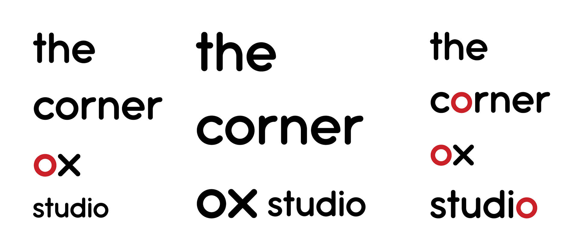
Each round of ideating and experimenting was also a round of simplifying. The constant elements were the numeral 5 and the moon. Focusing on these, I combined the 5 into the moon as if it was one of the craters of the moon in the final logo. The name "The Corner Ox" is not a typical combination of words, so I kept the type simple with a rounded sans serif font, Antipasto Pro Semibold. I also chose to use lowercase type to keep the emphasis on the moon and 5.
RESULT
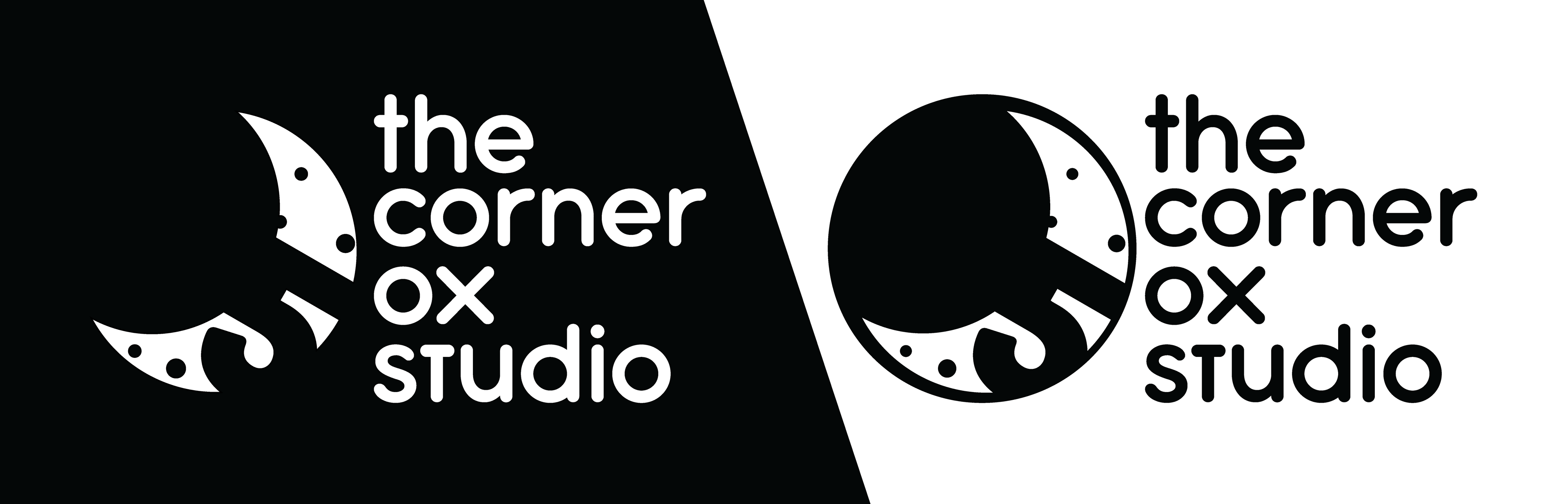
The final logo works both against a light background, showing the full circle of the moon, as well as just the crescent moon against dark backgrounds.